If you have an American Express credit card, it’s work checking the “Offers” section of your online credit card account. Of course, not everyone will be targeted for all of these, but you are likely to have at least 1 or two. These are available on all American Express credit cards.
In this article
Amex Offer: +4 Membership Rewards Points Per Dollar at Amazon
First, you can register to get 4 extra Membership Rewards points at Amazon, up to 1,500 bonus points. I got this offer on my American Express Gold Card.
Note that you can do better on Amazon with a Chase Ink Business Cash card as you can buy Amazon gift cards at Staples or Office Depot and earn 5X Chase Ultimate Rewards points on that card for an office supply store purchase.
(Note: I’ve written about that before. See Using the Chase Ink Business Cash credit card for 7.5% or more off of just about anything)
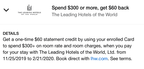
Next, you can get $60 off $300 at the Leading Hotels of the World group of hotels.
I had this offer on my Blue Business Plus Credit Card from American Express (which also earns 2X Membership Rewards on everything, on up to $50,000 a year).
And finally, a pretty huge Amex offer for JetBlue Vacations
This was on my Amex Gold Card.
$400 off $1,500 is pretty amazing if you were thinking about a vacation package (JetBlue flight + hotel) through JetBlue.
Do you find Amex Offers pretty straight forward? Or should I write a post about the basic mechanics of how Amex Offers work?
Tell me here, on Twitter, or in the private MilesTalk Facebook group.
You can find credit cards that best match your spending habits and bonus categories at Your Best Credit Cards.
New to all of this? My “introduction to miles and points” book, MilesTalk: Live Your Wildest Travel Dreams Using Miles and Points is available on Amazon and at major booksellers.


![Chase Revamps Entire United Credit Card Lineup – See What’s Changed [COMPREHENSIVE] chase united credit card refresh](https://milestalk.com/wp-content/uploads/2025/03/united-refresh-218x150.jpg)


![[LAST DAY to BOOK OLD RATES] Hyatt’s Annual Category Change is March 25th: What You Need to Know Grand Hyatt Kauai - Lobby](https://milestalk.com/wp-content/uploads/2021/04/IMG_1291-2-218x150.jpg)


![Amazon “Pay One Point” Deal Links (Compilation) [UPDATED] amazon pay one point pay 1 point links amex chase citi discover](https://milestalk.com/wp-content/uploads/2023/11/payonepoint-218x150.png)


![What to know about the Chase 5/24 rule on credit card signups [2025]](https://milestalk.com/wp-content/uploads/2016/04/524-218x150.jpg)

I believe the Amex Offers work as described most of the time, but the layout is terrible. The constant scrolling for each card to add an offer and then the scrolling of offers previously added to each card and then the savings from each card. They should have a grid with the offer and expiration on the left, all your linked cards across the top and a descriptor with Add, Added, Earned or Expired where the column and row meets. They could add balloons with descriptive text when your cursor moves over an item for more info.
Their layout takes too much time and has no sorting capability whatsoever. Maybe even a highlight and/or sort function to make it easy to see the offers you are really interested in (as opposed to offers just added to get above the 100 limit threshold).